
PROJECT OVERVIEW
Los Angeles County Fair
Project: Website Redesign (spec)
Client: Los Angeles County Fair
Role: UX/UI Designer | Information Architect
Tools: Sketch, InVision, Photoshop, Lucid Chart
The Los Angeles County Fair was established in 1922 and is the fourth largest fair in the country. It highlights California heritage and offers food, activities, and games. The fair would like to improve navigation on their site and streamline the ticket checkout system.
The Challenge
LA county fairgoers are frustrated by the time and effort it takes to purchase a ticket on the website. How might we guide them to make this process more simple and efficient.
The Solution
Identify pain points and delays people encounter when trying to buy tickets. Then use this information to design a checkout process that is more efficient leaving customers feeling pleased and appreciated.
RESEARCH
Interviews
Through interviews I gathered qualitative data on customers experiences with online ticket sales.

“Basic access and usability is important”

“If it is a clear, smooth, easy experience...something that is quick and to the point”
Trends
Customers shared these three points, when ask about positive experiences with online ticket sales.
Ease of use during checkout
Clear information on the event so they could plan accordingly
A timely checkout process
Heuristics
By doing a heuristic evaluation I identified the weak points of the checkout process on the website.
Confusing CTA’s
Menu navigation
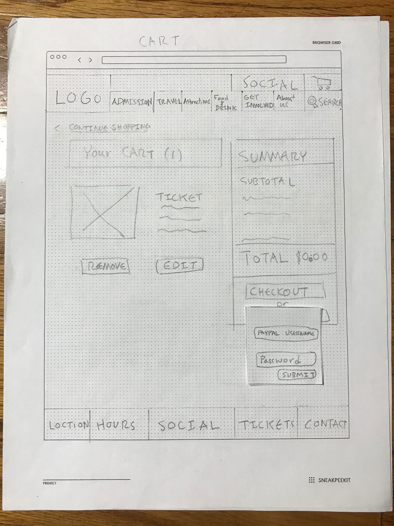
Password protected payment system
Synthesis
Persona
I consolidated my research data in order to determine the user I was designing for. This consolidation formed my persona Stevie. If my design was addressing Stevie’s needs then I knew I was on track.

Journey Map
I decided to take Stevie on a journey through the current website, this way I could identify pain points with his goals in mind.

Insights
The navigation of the website is cluttered and confusing frustrating Stevie.
The checkout process is lengthy cutting into valuable dog walking time.
There are confusing graphics that look like CTA’s.
With these pain points Identified I was ready to start redesigning the site.
IDEATION
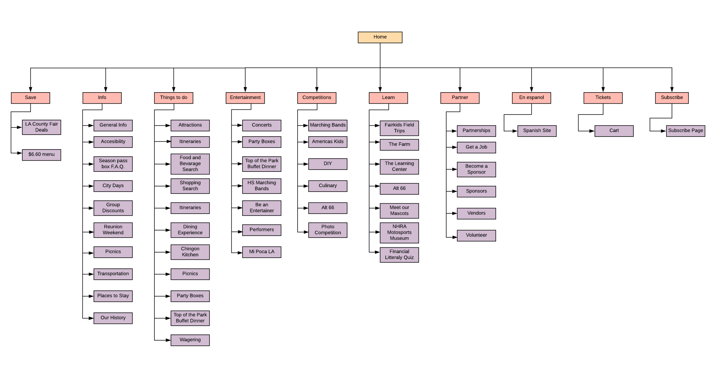
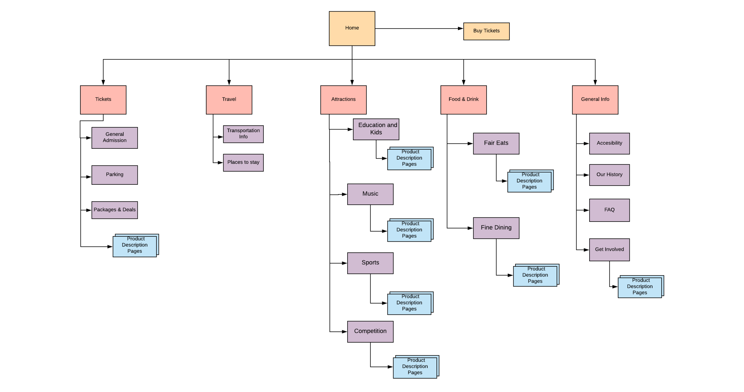
I knew immediately to address the information architecture of the site. I created a site map and after analyses I realized the breadth of the website was too broad and the categories were not clearly defined.
Card Sort
The solution for this was an open card sort. Participants created a new schema that was deeper and had more concise categories.


In comparison of the site map before and after you can see that the new schema is much more navigable. It has a shorter breadth and more subcategories.
I also reduced depth by creating pages that nested links to similar event pages instead of having a separate pages for each of them in the dropdown.
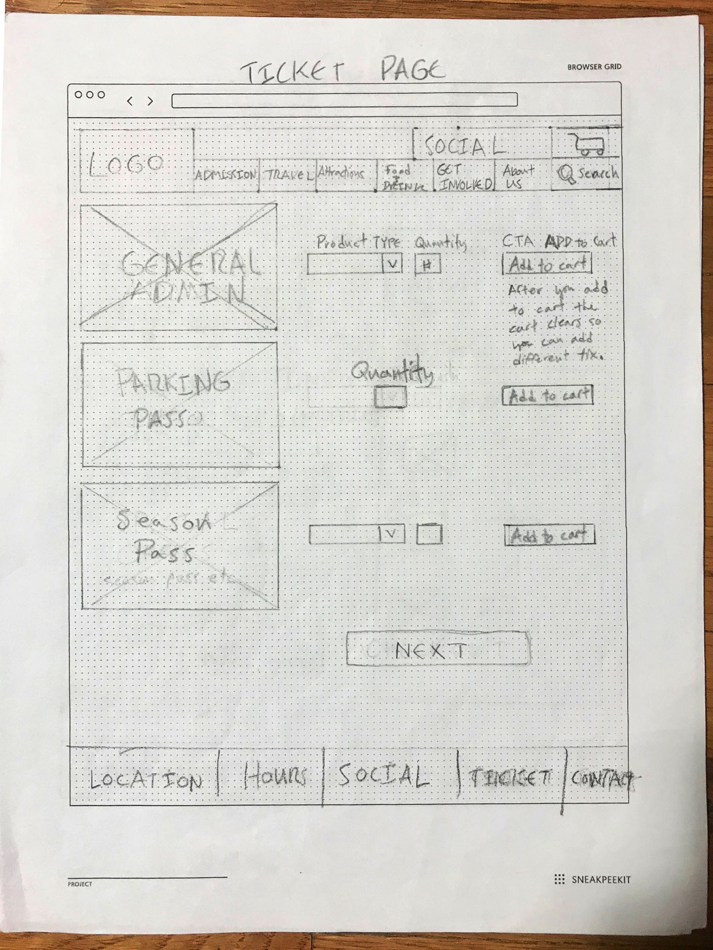
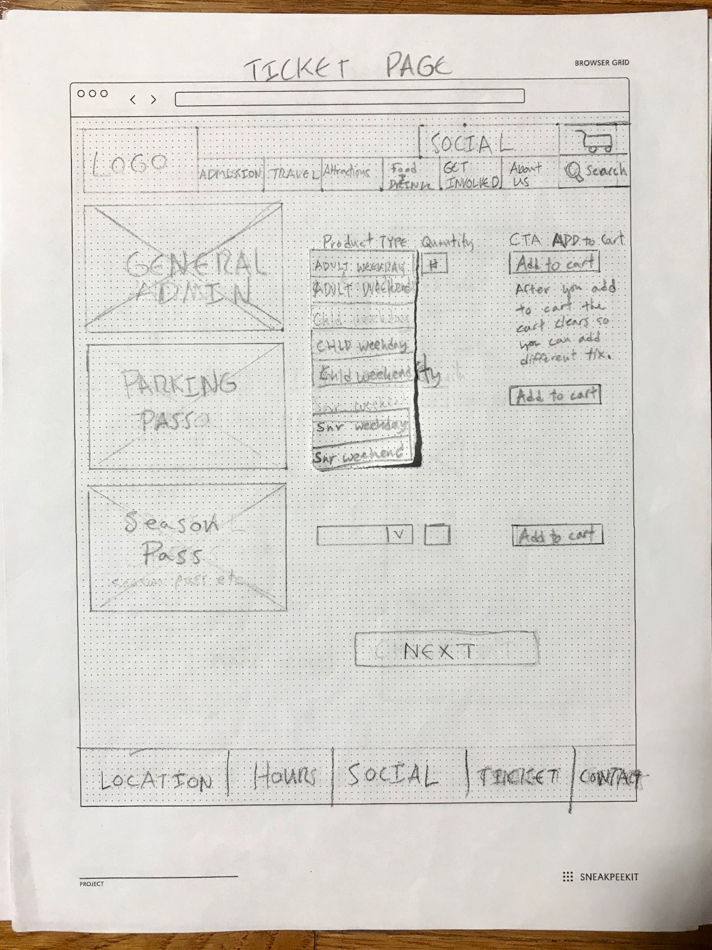
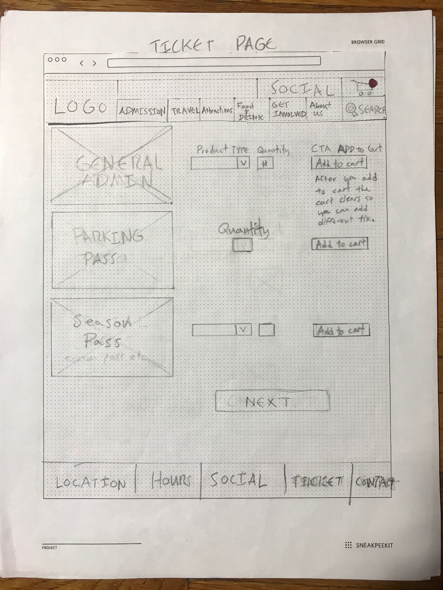
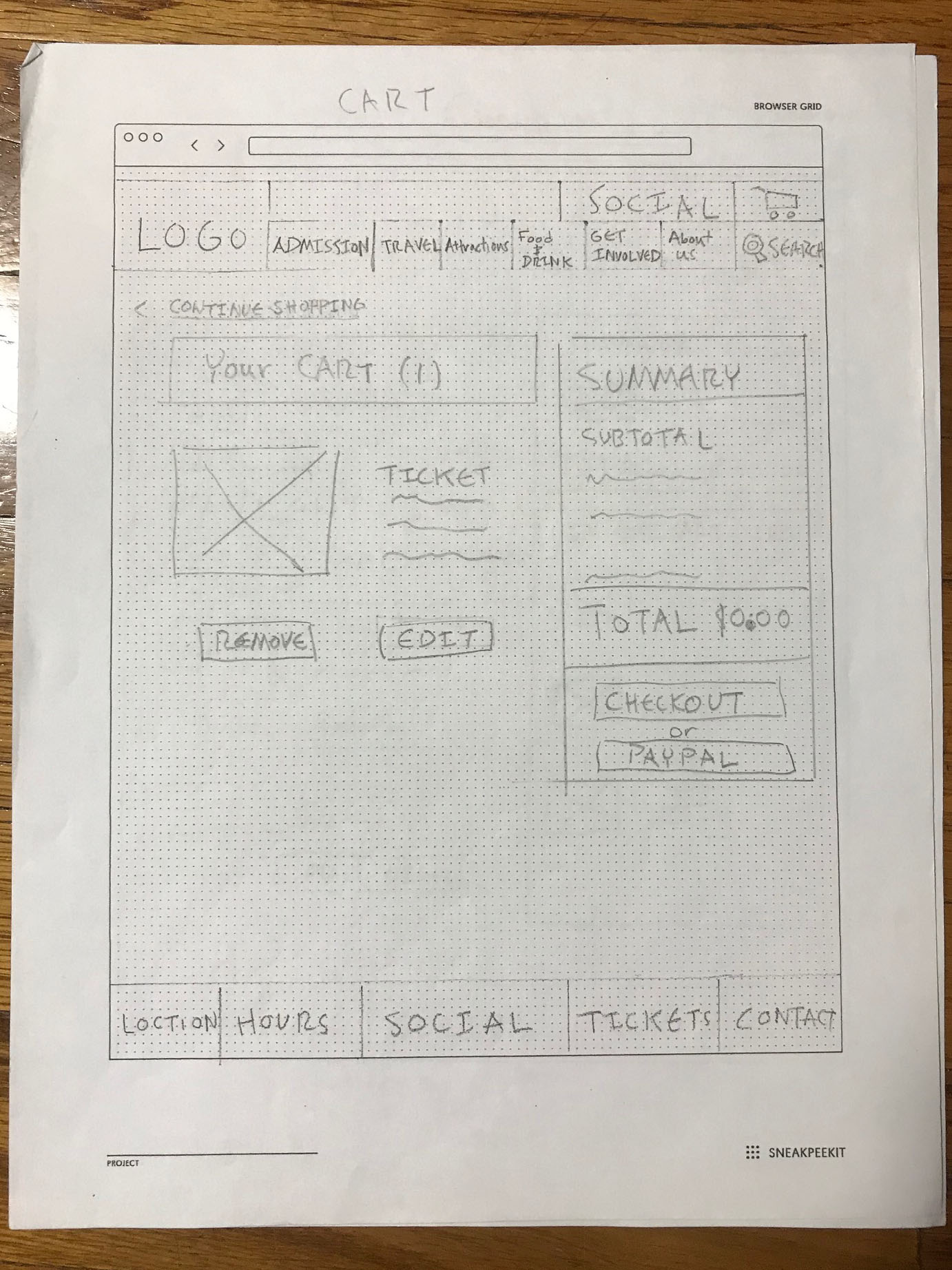
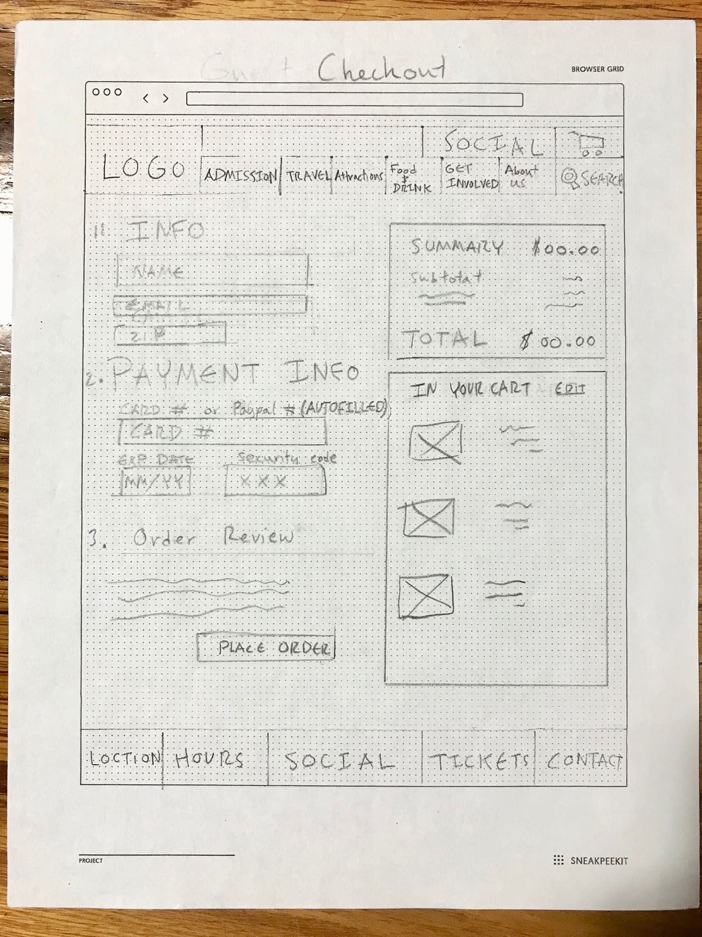
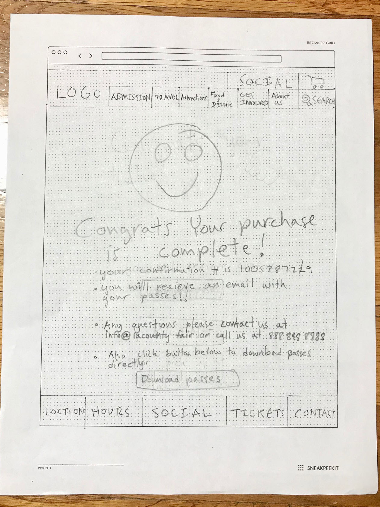
Paper Prototypes
With the problem of the ticket checkout and the information architecture identified I created paper prototypes of a new website to address them. It had a redesigned navigation schema and a simplified payment process.
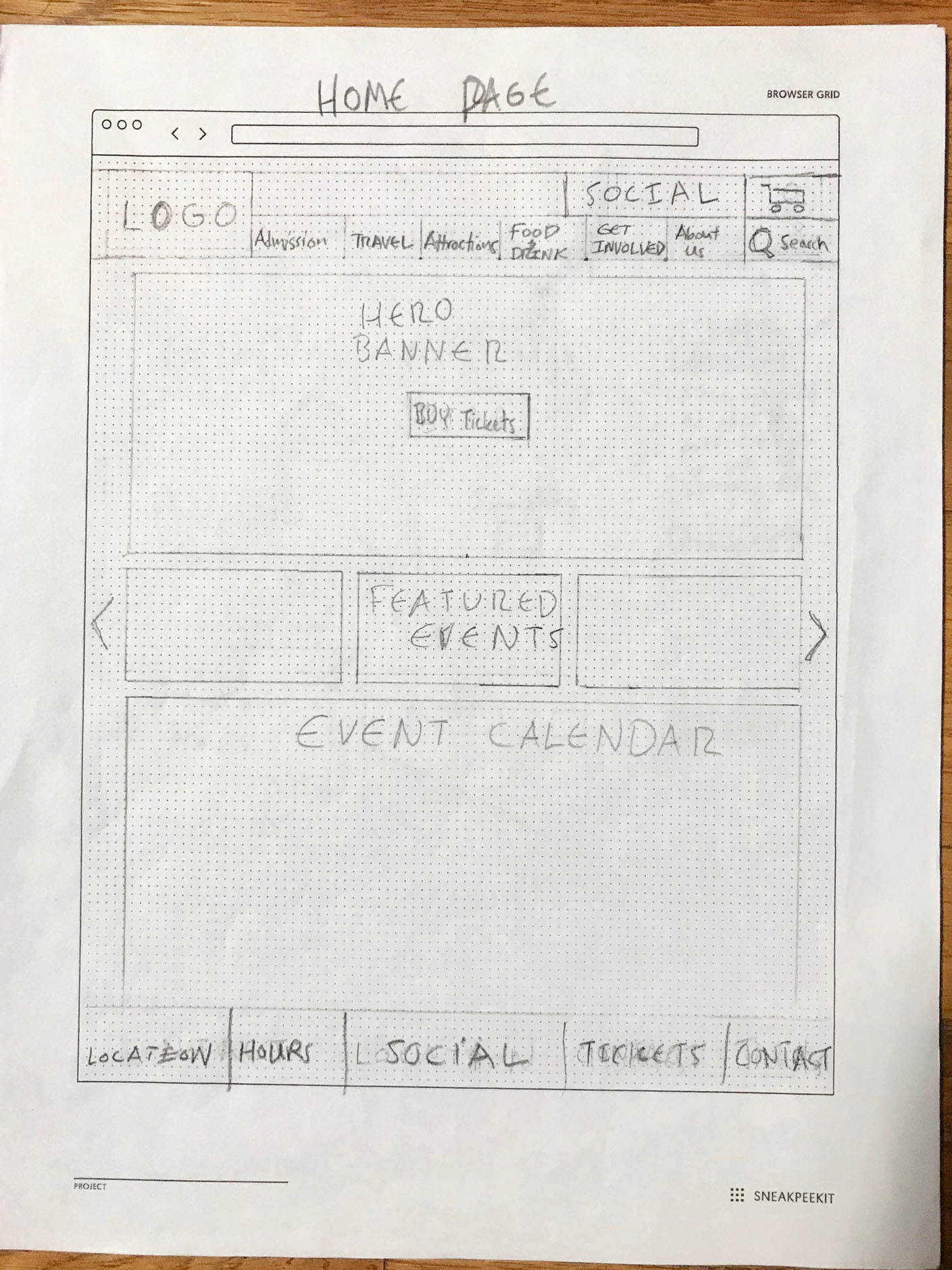
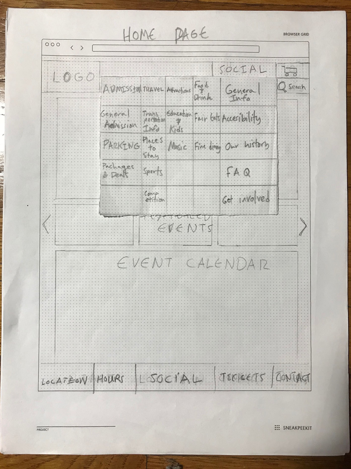

Testing
The prototypes were tested with fewer steps in the checkout process, I felt this would make the checkout more efficient.


Insight
If you reduce a problem to the least amount of steps possible you may find yourself with less steps but a more complicated problem.
Solution
I had to create a flow that still had multiple steps but the steps had a higher learnability factor and were much more productive.
With these solutions in mind, I was ready to design higher fidelity prototypes.
PROTOTYPE
User Scenario
Stevie is going to attend the LA county fair, he likes to purchase his tickets online beforehand in order to save time and plan accordingly.
Medium Fidelity Prototypes
With updates to the design I developed medium fidelity prototypes to help Stevie complete his scenario.

Home Page

Checkout Page

Ticket Selection

Confirmation Page
Metrics
With usability testing I found that the new design was more efficient. There was a drastic reduction in time spent purchasing tickets and there were less steps to complete the process.

The original flow consisted of 10 confusing steps and took over 8 1/2 minutes to complete.

The updated flow was reduced to 7 intuitive and efficient steps and took under 2 minutes to complete.
High Fidelity Prototype
With a new style guide and an updated flow I created the high fidelity prototypes.
(click below to watch video)

Next Steps
Moving forward I would like to build out a mobile version of the site and integrate responsive web design. I would also like to build out the user flow for vendor relations and integrate that into the prototype.